The Logo of La Boîte interculturelle
When Abstract Painting Becomes Universal Language — A Symbolic Reading by Drew Harris
A logo is never simply an image. It is a visual promise, a first breath of meaning even before the word is spoken. That of La Boîte interculturelle, designed by visual artist Drew Harris, tells a story of convergence, lightness, and shared belonging.
A Logo Born from Experience of the World
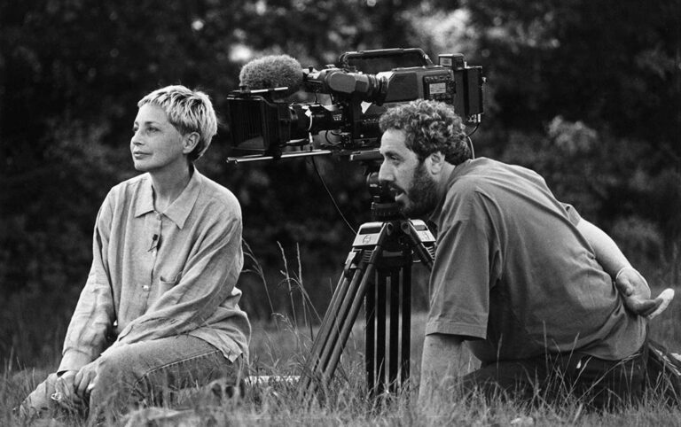
Drew Harris is an artist whose very life is a canvas: adventure, humility, creative freedom, and resilience have intertwined for over thirty years. In 1990, he abandoned a promising career in design to fully embrace painting. Now based in Kuala Lumpur, Malaysia, he carries in every stroke the memory of lands crossed, cultures encountered, losses and gains.
“I am a storyteller in visual abstraction. My work asks those who view it to engage, to experience it as I have experienced it.“
— Drew Harris, Kuala Lumpur, January 2025
Earth Tones: A Palette of Belonging
Before any form, it is color that establishes the atmosphere. Harris deliberately chooses earth tones — those ochres, siennas, clays, and sage greens found in soils around the world. These hues are neither Nordic nor tropical: they belong to all continents. They evoke the earth as shared space, the raw material from which all human cultures emerge.
Three Symbols, One Vision
The logo weaves together several symbolic languages, each bringing its own resonance.
Convergence
All lines reach toward a central point — the encounter, the living heart of the intercultural.
Flight & Lightness
The lightness of the butterfly — intercultural dialogue as flight, as liberation.
Lotus
Symbol of universal awakening: beauty that blooms from murky depths.
Flowering
The opening flower — the flourishing of cultures when they recognize one another.
Overlapping of Cultures
Layers that overlap without dissolving — identity enriched by encounter.
Sound Announcement
A radiating vibration — the voice of the organization carried into the world as resonance.
The Balance of Tensions: Serious and Light, Feminine & Masculine
Harris wanted a logo that is both corporate and organic, established and living, serious and poetic. This duality reflects La Boîte interculturelle itself: an organization grounded in institutional rigor, yet carried by the human warmth of dialogue. The form oscillates between the robustness of a recognized corporate emblem and the grace of an opening flower — neither strictly feminine nor strictly masculine, but inhabiting both at once.
This is where the genius of this design resides: in its capacity to hold together opposites without erasing them. Like the intercultural itself.
The Visual Storyteller Behind the Emblem
For Drew Harris, each work is a public journal entry. His logo for La Boîte interculturelle is no exception. He deposits within it his decades of fertile wandering: love of the earth and of home, the pain of absence, the irreducible joy of creation. It is not merely a graphic sign — it is an invitation to walk together, silently, forward.
Same Soul, New Colors
The Chromatic Evolution of the Logo of La Boîte interculturelle — A Continuity in Spirit, A Rebirth in Light.
A logo that evolves does not betray its origins: it reveals them differently. Since its initial conception in the warm tones of earth, the logo of La Boîte interculturelle has undertaken a chromatic journey toward lighter, more airy hues — without ever leaving the essence of what it was from the very first day.
From Earth to Sky: The Evolution of Colors
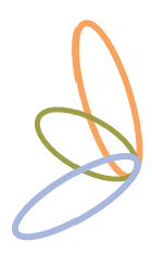
The original version of the logo was anchored in ochres, siennas, and clays — a palette that evoked raw material, the common ground of all human cultures. Drew Harris infused it with his love of earth and belonging. Then the logo transformed. The three ellipses that compose it took on new hues: a luminous sky blue, a silver gray, and a warm golden orange. Three colors for three dimensions of the same movement.
Three Ellipses, Three Color Languages
Sky Blue
Openness, horizon, and dialogue. Blue evokes the fluidity of intercultural communication — like the sky that belongs to everyone.
Silver Gray
Benevolent neutrality and listening. Gray is the meeting space — neither dominant nor erased, it holds the balance between voices.
Golden Orange
Human warmth, grounding, and vitality. The gold inherited from original lands persists — transformed into radiant light.
Together, these three ellipses interlock into an immediately recognizable silhouette: that of a butterfly in flight. This is no accident. The butterfly has been since antiquity the symbol of transformation — the caterpillar that becomes other without ceasing to be itself. This is precisely what every person engaged in an intercultural journey experiences.
Continuity in Spirit
Despite this change in chromatic register, the symbolic essence of the logo remains intact. The ellipses still overlap — cultures do not cancel each other out, they traverse one another. The movement still converges toward a central point — the encounter remains the beating heart. The lightness of the butterfly endures — intercultural dialogue is still a flight.
What has changed is the light. The earth tones referred to origin, to soil, to rootedness. The new colors look toward the sky: they speak of aspiration, of circulation, of a world where borders open. Harris, a traveling painter based in Kuala Lumpur, knows this tension between roots and horizons better than anyone.
An Emblem That Grows with Its Mission
La Boîte interculturelle is not an organization frozen in its foundations — it is alive, in constant dialogue with the changing world. It was fitting that its logo should grow with it. The chromatic evolution is not a rupture: it is a breath. Like these ellipses that never quite close, always leaving a space where something new can enter.